Opening your own store in New York is exciting, but it can also feel overwhelming. Every decision affects how customers experience your space.
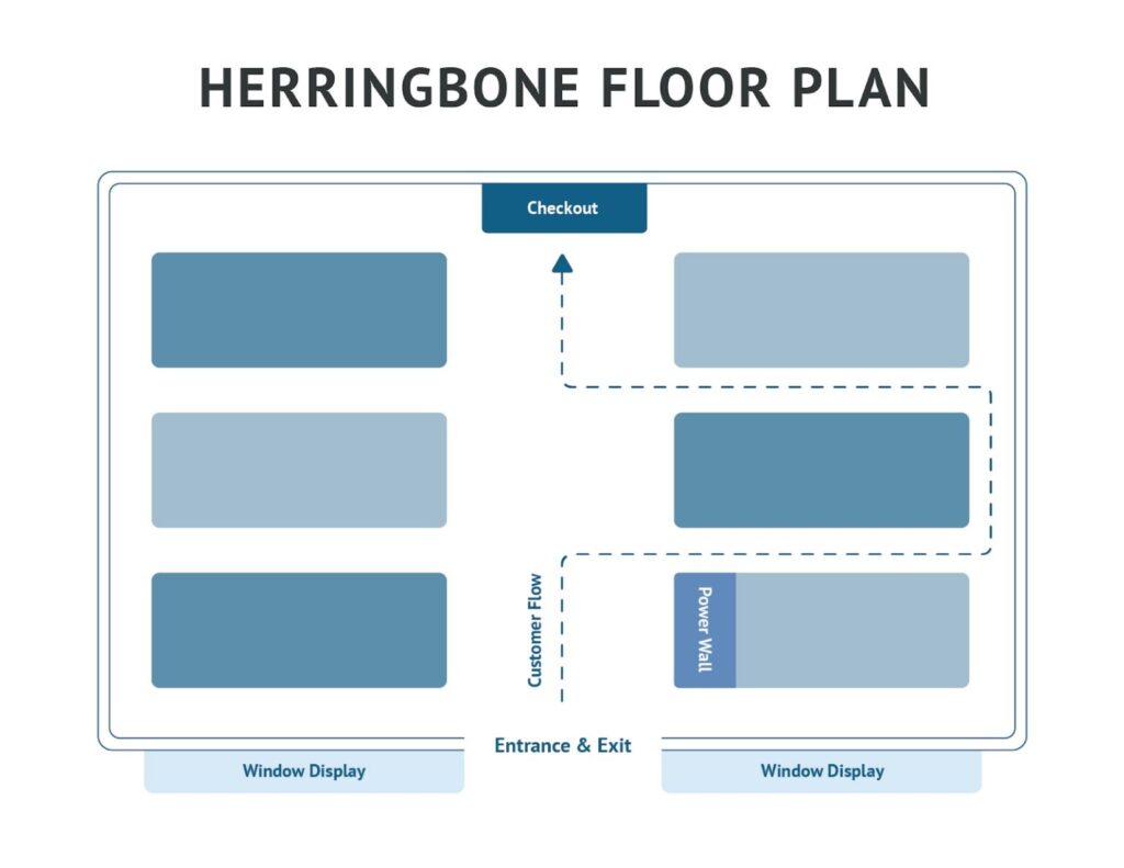
If you’re thinking about store design, the herringbone layout is a smart option. Simply put, it’s a design where the aisles are arranged at an angle, creating a zigzag pattern that resembles the bones of a herring fish — hence the name “herringbone.”
This layout isn’t just visually appealing. It helps guide customers naturally through your store, maximizes product visibility, and makes even narrow or oddly shaped spaces feel open and inviting.
Let’s break down what makes the herringbone layout so effective and how you can use it to enhance your store’s design.
What is a Herringbone Store Layout?
Imagine walking into a store where the aisles aren’t just straight lines but gently angled paths that guide you through the space. This is the essence of a herringbone store layout. The aisles are set diagonally, forming a repeating V-shaped pattern that takes its inspiration from the distinctive structure of a herring fish.
In a herringbone layout, the central aisle serves as the main artery, with angled side aisles branching off. This structure naturally directs customer flow. It’s particularly effective in narrow or irregularly shaped spaces, which makes the most of every square foot.
Key Characteristics of Herringbone Layout
Once you start visualizing how a herringbone layout works, it becomes easier to see why so many retailers love it. Let’s take a closer look at the key features of this layout:
Angled aisles
Instead of running straight from front to back, the aisles are set at an angle. This small design choice makes a big difference.
Shoppers naturally feel guided, almost as if the store itself is leading them forward. It prevents the space from feeling too rigid or overwhelming and adds a touch of rhythm to the shopping journey. You might notice customers slowing down to notice your products as they move along the aisles.
Central traffic aisle
At the heart of every herringbone layout is a main aisle that acts as the store’s central pathway. This is where shoppers begin their journey and where their eyes are drawn first.
It creates a clear line of direction and gives customers an easy way to navigate, especially helpful during busy hours or sales.
Diagonal product displays
One of the most practical advantages of the herringbone design is that it allows customers to see more of your products at once.
Because the shelves are angled, shoppers can glance down an aisle and instantly spot what’s available without having to walk every inch of the store. For you, as the owner, this means your merchandise gets better chances of being noticed.
Pros of Herringbone Store Layout
When you start thinking about how your customers move through your space, the benefits of a herringbone layout become clear.
Here are some of the ways this design can help your New York store stand out and operate more effectively:
Stylish and modern
A herringbone layout isn’t just functional; it’s also visually striking. The angled aisles create a dynamic flow that feels both contemporary and timeless. It’s a design that speaks to the sophistication of New York’s retail scene.
Maximizes available floor space
New York retail spaces often come with their own set of challenges, especially when dealing with narrow or irregularly shaped layouts. The herringbone design helps make the most of every square foot. By angling the aisles, you can fit more product displays without making the space feel cramped.
Guides traffic flow
One of the standout features of the herringbone layout is its ability to naturally guide customers through your store. The angled aisles create a path that encourages exploration, leading shoppers from one section to the next.
Creates an organized, professional look
In a city where first impressions matter, a well-organized store can set you apart. The herringbone layout offers a clean, structured appearance that conveys professionalism and attention to detail.
Cons of Herringbone Store Layout
While the herringbone layout offers many advantages, it’s important to consider its potential drawbacks so you can decide if it’s the right fit for your store.
Can feel restrictive compared to a free-flow layout
Because the aisles are angled and follow a structured pattern, some shoppers may feel guided too rigidly and miss the sense of exploration that comes with wandering freely through a store. If your brand relies on a casual, discovery-driven shopping experience, this is something to keep in mind.
Limited flexibility for creative displays
Large promotional setups or temporary interactive installations can be harder to accommodate within the angled aisles. If your store frequently rotates displays or wants to experiment with unique arrangements, you may find it slightly constraining.
Security risks
Security risks are another factor. The angled aisles can create blind spots, which could make it harder to monitor certain areas of your store. Installing additional cameras or placing staff strategically may be necessary to maintain security without disrupting the flow.
Not ideal for very large or open-plan stores.
Finally, the herringbone layout is not ideal for these stores. In expansive spaces, the zigzag pattern can feel forced or disjointed, and customers may prefer a more open layout that allows for unrestricted movement.
Best Practices for Designing a Herringbone Store Layout
Once you understand how a herringbone layout works, the next step is making it work for your store. Keep these best practices in mind:
Align aisles with sightlines toward focal points
Think about where you want your customers’ attention to go first. It might be a seasonal display, a best-seller, or a new arrival. This strategy naturally leads shoppers’ eyes toward these key areas.
Use endcaps for featured products
Endcaps are prime spots at the ends of your angled aisles, perfect for showcasing featured products. Placing seasonal items, new arrivals, or promotional products here ensures they catch shoppers’ eyes immediately.
For example, a candy shop in Brooklyn might use an endcap to display limited-edition holiday treats, while a small fashion boutique in Albany could feature a trending handbag or accessory.
Use signage and lighting to guide movement
Even with angled aisles directing movement, clear signs, warm spotlights, and contrasting colors draw shoppers’ attention and emphasize the products you want to highlight.
Let’s say you use deep navy signs with gold lettering to make a new handbag collection stand out against neutral-toned shelving.
Balance between functional flow and aesthetic appeal
Balancing functional flow and aesthetic appeal can be tricky because you’re trying to do two things at once. The key is finding a middle ground where angled aisles, displays, and décor work together to guide shoppers smoothly while keeping the space visually appealing.
Stores That Work Well with a Herringbone Layout
Not every store benefits equally from a herringbone layout, but certain types of shops can use it to their advantage. These include:
Bookstores and libraries
In smaller bookstores or library sections, angled aisles can help steer visitors smoothly through the space. This arrangement allows customers to browse more titles without feeling crowded.
Hardware and home improvement stores
Mid-sized hardware stores or specialty tool shops can benefit from angled aisles to showcase featured items and direct traffic efficiently. Very large stores like Home Depot or Lowe’s typically use straight-grid or free-flow layouts instead, because the herringbone pattern can feel restrictive in open, warehouse-style spaces.
Small fashion boutiques
If you own a fashion boutique, you understand the challenge of making the most of limited floor space. Angled aisles allow owners to showcase clothing and accessories while creating a curated feel.
Specialty shops
Shops selling gourmet foods, teas, candies, or unique gifts can use a herringbone layout to highlight featured products and seasonal items. This makes sure that new merchandise doesn’t go unnoticed.
Summary
Angled paths in a store, created by a herringbone layout, create a shopping experience that feels intuitive. Whether you’re running a boutique in Rochester, a specialty food shop in Albany, or a small bookstore in Syracuse, the herringbone layout can help your store stand out in a crowded market.
When it comes to bringing your vision to life, the right fixtures and furniture make all the difference. Choose Artistic Display for your retail and commercial furniture solutions in New York!