

When you walk into a grocery store in New York, you’ve probably noticed how the aisles are lined up neatly. Everything feels organized, and you can quickly find milk, bread, or your favorite snack without getting lost. This setup isn’t random — it’s called a grid store layout.
In this guide, we’ll explore what a grid store layout is, the key parts that make it work, and the pros and cons for both customers and retailers. By the end, you’ll see why so many stores choose this classic design.
What is a Grid Store Layout?
A grid store layout is a way that stores organize their shelves and aisles in straight, parallel lines, much like the streets of a city grid. This design helps customers find what they need quickly while allowing stores to display many products in an organized way. It is one of the most common layouts used in supermarkets, drugstores, and convenience stores.
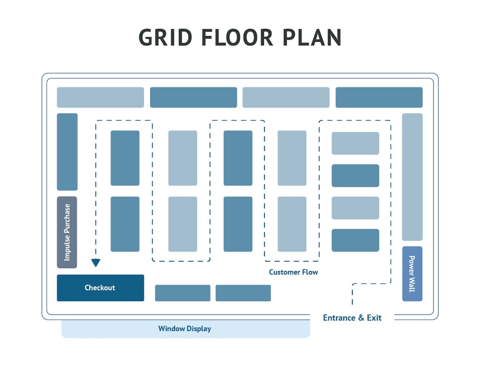
When it comes to key features, a grid store layout focuses on order and predictability. Straight, parallel aisles help shoppers move easily, while main and side pathways guide them through the store. End caps showcase promotions or seasonal items, and checkout counters are placed near the front or side for easy exits.
Picture walking into a supermarket where long aisles run straight ahead, with neatly organized shelves on either side. Each aisle is dedicated to a specific category, like snacks or cleaning supplies, and end caps display featured items. Wide pathways ensure shoppers can move comfortably.
Key Elements of a Grid Store Layout
To understand why a grid store layout works so well, it helps to look at the main elements that make it effective:
Entrance and Sightlines
The entrance is the first impression shoppers get of the store. In a grid layout, entrances are designed to provide clear sightlines down the main aisles so customers can quickly see where different sections are located.
For example, at a Price Chopper in Syracuse, the wide entrance opens up to produce and dairy sections, allowing shoppers to spot fresh items right away.
Main and Secondary Aisles
Main aisles are wider pathways that direct shoppers through the store, while secondary aisles branch off to give access to specific product categories. This combination helps keep traffic moving smoothly.
End Caps and Promotional Displays
End caps are the shelves at the end of each aisle and are often used to feature sales, seasonal items, or new products. These displays are strategically placed to catch the shopper’s eye as they move through the store.
Checkout Counters
Checkout counters are positioned to keep the flow of shoppers organized and reduce congestion. Grid layouts often place registers at the front or side of the store, making it easy for customers to complete their purchases and exit.
At a Stop & Shop in Albany, the registers are lined up along one side with small promotional displays nearby, guiding shoppers naturally toward the exit.
Category Signage and Wayfinding
Clear signs help customers quickly identify different sections. Large, visible signage above aisles and consistent labeling on shelves reduce confusion and speed up shopping.
Lighting and Visibility
Good lighting matters for both safety and product visibility. Bright, evenly lit aisles help shoppers find what they need and make products look more appealing.
Advantages of a Grid Store Layout
Now that we’ve looked at the main elements, let’s explore why so many retailers, especially in New York, choose this design.
Maximizes product exposure
The straight aisles allow retailers to display a large variety of products in an organized way, making sure every shelf is easy to see and reach.
This setup also gives stores the flexibility to group items by category — like cereals together or cleaning supplies in one section — so shoppers can find what they need faster.
Easy navigation for customers
Because aisles are arranged in a predictable pattern, shoppers don’t waste time searching or backtracking. Even first-time visitors can figure out where things are after just a few minutes.
Efficient space utilization
Grid layouts use every inch of store space wisely. Long, parallel aisles allow retailers to fit in more shelving without creating chaos, which means more products available in the same footprint. This is especially valuable in New York City, where retail space is expensive and often limited.
A compact drugstore in Brooklyn, for instance, can carry everything from medicine to toiletries by relying on this efficient layout.
Encourages impulse purchases at aisle ends
End caps are powerful tools in a grid store. They highlight deals, new arrivals, or seasonal goods that customers might not have planned to buy.
Your store, for instance, might place discounted chips or holiday-themed treats at the end of an aisle to prompt shoppers to toss them into their carts as they walk by.
Easier to manage security and stocking
Clear sightlines are another big advantage. Employees can quickly scan down an aisle to check inventory levels, restock items, or keep an eye on customer activity. This not only makes the store run smoothly but also improves safety and reduces theft.
Disadvantages of a Grid Store Layout
While grid store layouts have many strengths, they also come with some drawbacks. Depending on the type of store and shopping experience you want to create, these limitations can be important to consider.
Can feel monotonous or overwhelming
Because everything is arranged in straight rows, the layout can feel repetitive. For some shoppers, especially in large supermarkets, the endless aisles may feel overwhelming or tiring. For example, walking through a Walmart can sometimes feel like navigating a maze, especially when the store is crowded.
Less effective for experiential or luxury shopping
Grid layouts are practical but not always ideal for stores that focus on creating an experience.
High-end retailers, like specialty boutiques in Manhattan’s SoHo district, often prefer open or free-flow layouts because they encourage browsing and create a more stylish, relaxed atmosphere. A strict grid design can feel too plain for this type of shopping.
May not encourage browsing outside of list-driven purchases
Since aisles are designed for efficiency, many customers simply walk in, grab what’s on their list, and head to checkout. Unlike more creative layouts that invite exploration, a grid store may not inspire shoppers to discover new products.
When to Use a Grid Store Layout
Grid layouts are best for stores that carry a wide variety of products and expect steady foot traffic every day. This includes supermarkets, drugstores, hardware stores, and other high-volume retailers.
Your store may also benefit from a grid layout if customers often have trouble finding items or if your current layout feels cramped and disorganized.
Another sign is if you carry a large selection of products that need to be categorized clearly, like groceries, household goods, or hardware. If restocking takes too long or employees can’t easily monitor aisles, a grid layout may solve those problems by creating predictable patterns and clear sightlines.
Many well-known retailers use this system because it consistently delivers results. In New York State, stores like Wegmans, CVS, and Price Chopper rely on grid layouts to balance product variety with easy navigation. Walmart and Target also use this layout in most of their locations.
Tips for an Effective Grid Store Layout
A grid layout works best when it’s designed with both the customer and the store’s needs in mind. Here are some tips to make your layout more effective:
Use wide aisles for customer comfort
Narrow aisles can make shopping stressful, especially during busy times. Keep main aisles wide enough so carts and customers can pass easily. Wider aisles not only improve traffic flow but also make the store more accessible for parents with strollers, elderly shoppers, and people with disabilities.
Place essentials at the back to increase exposure
Everyday items like milk, bread, or batteries should be placed toward the back of the store. This encourages shoppers to walk past other products along the way, which increases exposure and sales.
Position high-margin products at eye level
Eye-level shelves are the most valuable real estate in any aisle, so use them for products you want customers to see first, whether it’s a new arrival or a popular favorite. For example, you might place a new line of organic snacks or a best-selling cleaning spray at this height to make sure it grabs attention right away.
Optimize end-of-aisle displays
Use them to feature seasonal goods, new arrivals, or sale items, but don’t stop there — refresh them often so customers stay curious, pair complementary products to encourage impulse buys, and use bold signage or lighting to draw extra attention.
Keeping end caps uncluttered and easy to shop also helps maximize their impact.
Keep consistent signage and clear labeling
Clear, easy-to-read signs help shoppers find items quickly and reduce frustration. Color-coded categories or bold aisle markers can be very effective.
A Home Depot in Albany uses large, overhead signage for departments like Paint or Plumbing, which makes it simple for customers to get where they need to go.
Common Mistakes to Avoid in Grid Store Layouts
Even with its many advantages, a grid store layout can fall short if it’s not executed well. Small design errors can create frustration for shoppers, reduce sales opportunities, and make the store harder to manage. It’s important to avoid these common mistakes:
Overcrowding shelves
Trying to fit too many products on each shelf can make the store feel cramped and discourage customers from browsing. Instead, aim for balance by keeping displays neat and leaving enough open space so products stand out.
Poor lighting
Even with a well-planned grid layout, dim or uneven lighting can ruin the shopping experience. Make sure aisles are bright, evenly lit, and free from shadows so customers can easily see products and signage.
Ineffective end cap usage
Leaving end caps empty or cluttered reduces sales opportunities. If they’re not refreshed often, customers will stop noticing them. Rotate displays regularly and keep them visually appealing.
Ignoring customer flow patterns
A grid layout creates predictability, but every store has unique traffic patterns. Pay attention to how your customers move — if certain aisles or sections are consistently overlooked, consider adjusting signage, product placement, or promotions to draw people in.
Real-World Examples of Grid Store Layout
To better understand how a grid store layout works in practice, let’s look at some well-known retailers that use this design successfully.
Wegmans

This New York-based grocery chain uses a grid system to balance product variety with customer convenience. Wide main aisles guide shoppers, while side aisles house specific categories, from bakery items to household supplies.
CVS
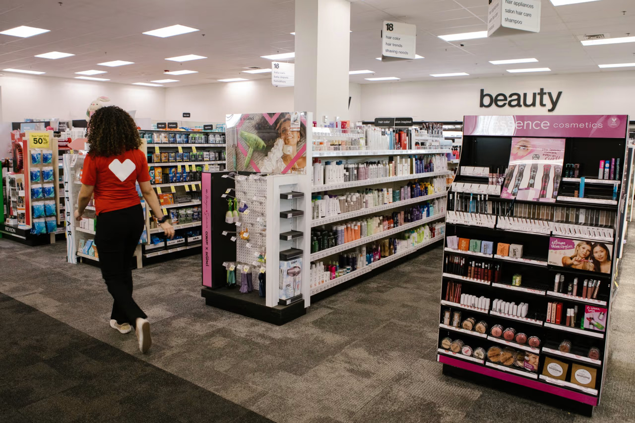
Drugstores like CVS rely heavily on grid layouts to keep aisles efficient and products easy to find. Essentials such as medications and beauty products are grouped clearly, while end caps promote seasonal deals and popular items.
Home Depot
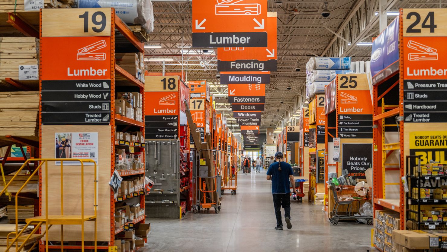
Although larger than a typical supermarket, hardware stores like Home Depot also benefit from a grid layout. Wide aisles accommodate bulky carts, and clear overhead signage directs customers to departments like Tools, Lighting, and Garden.
Summary
A grid store layout remains one of the most effective and widely used retail designs. Its strengths lie in organization, efficiency, and flexibility, which is why it the top choice for supermarkets, drugstores, and other high-volume retailers.
It may not provide the most luxurious or experiential atmosphere, but the grid system ensures customers can find what they need quickly, while allowing retailers to maximize space. If your store needs structure, efficiency, and a way to handle high traffic, a grid layout may be the best fit.
Looking to design or refine your store layout? Consider partnering with Artistic Display to create a grid system that’s both functional and visually engaging.
Frequently Asked Questions
What type of store benefits most from a grid layout?
Supermarkets, drugstores, hardware stores, and big-box retailers see the most benefit. With so many products and shoppers to manage, the grid layout keeps everything running smoothly.
Is a grid store layout good for small shops?
Yes, but with caution. Smaller stores may risk feeling too cramped if aisles are packed tightly. For compact shops, a modified grid with fewer aisles and more open space can help maintain order without overwhelming customers.
How much space do I need for a grid store layout?
There’s no single rule, but the layout works best in medium to large spaces where aisles can be wide enough for comfortable traffic flow. Even in smaller spaces, clear pathways and consistent shelving can create a grid-like feel that improves navigation.